


.webp)
.webp)
In custom measure tape branding, a logo alone is insufficient to build lasting recognition. A generic font can dilute your brand’s voice; mismatched colors can make your tape blend into competitors. As a leading custom measure tape OEM manufacturer, Wintape goes beyond surface-level logo printing—we embed your brand’s unique font and colors into every tape, turning functional tools into consistent brand touchpoints. This article explores how strategic font selection and color precision elevate branding, how OEM enables this depth of customization, and how Wintape delivers solutions that reflect your brand’s identity at every glance.
The Brand Gap of Logo-Only Custom Tapes
Logo-only custom measure tapes suffer from a critical limitation: they fail to convey your brand’s full identity, leading to weak recognition and inconsistency. A fitness brand using a generic sans-serif font for scale markings misses the chance to reinforce its energetic voice; a luxury tailor’s tape with off-brand pastel colors undermines its premium positioning. Suppliers often cut corners here—using standard fonts and approximate color matches—resulting in tapes that feel disconnected from your brand. Worse, poor font readability (e.g., tiny serif fonts on industrial measure tapes) reduces functionality, as users struggle to read scales. For brands aiming to build cohesive identity, logo-only tapes are a missed opportunity to make every element of the tape feel “on-brand.”
Importance: Highlights the core problem of logo-only customization—brand incompleteness—to justify the need for font and color integration, laying groundwork for Wintape’s value.
Brand Font: Choosing Typefaces That Speak to Your Identity
A brand’s font is its “voice” in visual form—and on custom measure tapes, it must balance readability, brand alignment, and durability. Wintape guides clients through three key font selection principles:
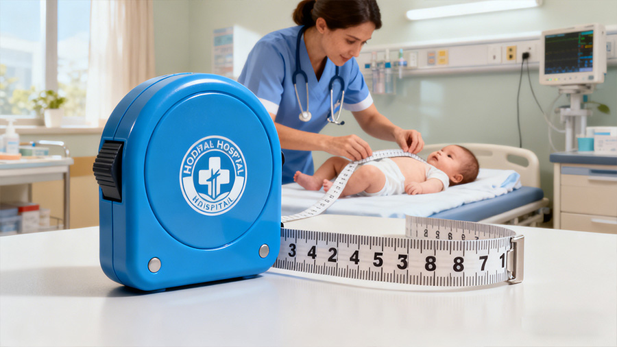
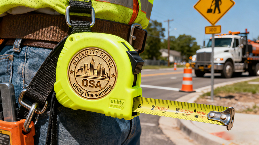
- Readability First: For custom medical measure tapes, we recommend clean sans-serif fonts (e.g., Arial Narrow) with 2mm+ letter heights—ensuring nurses can read scale markings quickly in busy clinics. For industrial measure tapes, bold fonts (e.g., Impact) resist blurring from job site dirt, maintaining legibility.
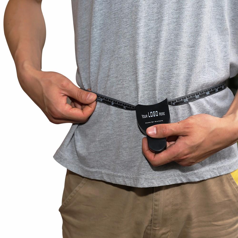
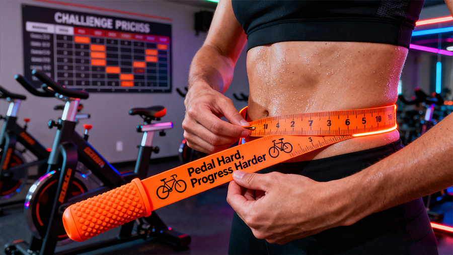
- Brand Alignment: A wellness brand might opt for rounded, friendly fonts (e.g., Quicksand) for customized fitness body tapes, while a construction brand chooses rugged slab-serif fonts (e.g., Rockwell) to reflect durability.
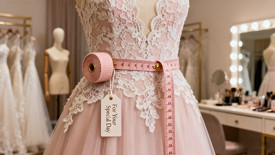
- Durability Integration: We embed fonts via laser engraving (for metal casings) or UV printing (for fabric/plastic blades)—ensuring typefaces don’t peel or fade. For example, private label tailor measure tapes use heat-embossed fonts that withstand repeated folding without smudging.
The right font turns scale markings and brand text into extensions of your identity, not just functional elements.
Importance: Positions font as a strategic brand asset, solving the problem of generic typography that dilutes identity and reduces usability.
Brand Colors: Precision & Durability for Consistent Recognition
Brand colors on custom measure tapes require more than “close matches”—they need precision, material adaptation,and long-term durability. Wintape’s color process addresses three critical challenges:
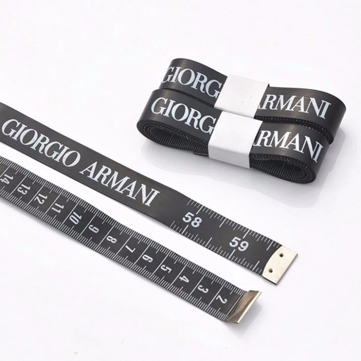
- Color Precision: We use the Pantone Matching System (PMS) to replicate your brand colors exactly—no “approximate” shades. For example, a café’s promotional measure tape keychains will match its signature mint green (Pantone 14-6315 TPX) on both the casing and blade, ensuring consistency with its store decor.
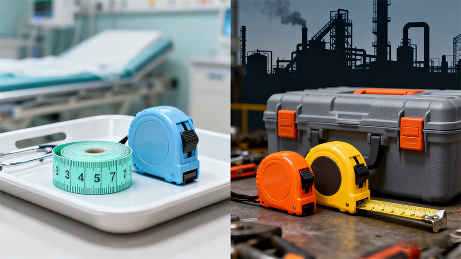
- Material Adaptation: Colors behave differently on various materials—PVC absorbs ink more than steel, so we adjust formulations for OEM industrial measure tapes (steel blades) vs. custom fabric tapes (fiberglass). This ensures your brand blue looks identical across all tape types.
- Durability Testing: We subject colored tapes to 500+ hours of UV exposure (to resist fading) and 100+ wash cycles (for fitness/textile tapes). For custom medical measure tapes, we use bleach-resistant inks that maintain color even after sterile cleaning.
Precise, durable colors ensure your tape is instantly recognizable as “yours,” even from a distance.
Importance: Solves the common issue of color inconsistency/fading, ensuring brand recognition remains strong throughout the tape’s lifespan.
Font & Color Synergy: Designing Cohesive Custom Tapes
Font and color work best when they complement each other—not compete. Wintape’s synergy design focuses on three key pairings:
- Contrast for Readability: For industrial measure tapes, we pair bold black slab-serif fonts with high-contrast yellow blades—ensuring scales are visible in low-light job sites. For medical tapes, soft gray sans-serif fonts on pale blue blades balance readability with a calming vibe.
- Tone Alignment: A children’s clothing brand’s private label fabric tapes use rounded fonts (friendly) and pastel pinks (playful)—reinforcing its kid-centric identity. A tech brand’s custom digital measure tapes pair sleek sans-serif fonts with metallic silver casings—reflecting innovation.
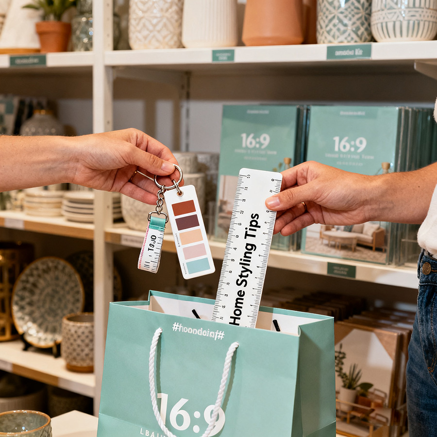
- Scale Harmony: We adjust font size to match tape dimensions—3mm fonts for small promotional keychain tapes (avoiding clutter) and 5mm fonts for large industrial tapes (ensuring visibility from afar).
This synergy turns tapes into cohesive brand assets, where every element feels intentional.
Importance: Prevents disjointed design (e.g., bold fonts with muted colors) that confuses users, ensuring font and color work together to strengthen brand identity.
Industry-Specific Font & Color Adaptation
Different industries demand unique font-color pairings—and Wintape’s OEM/ODM services tailor solutions to niche needs:
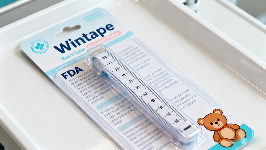
- Medical: Soft sans-serif fonts (Arial) + pale blues/whites for custom medical measure tapes—complies with healthcare’s “calming” design norms and ensures readability during patient exams.
- Fitness: Bold sans-serif fonts (Montserrat Bold) + neon oranges/greens for customized fitness body tapes—stands out in gym bags and reflects energy, with UV-stabilized colors resisting sweat.
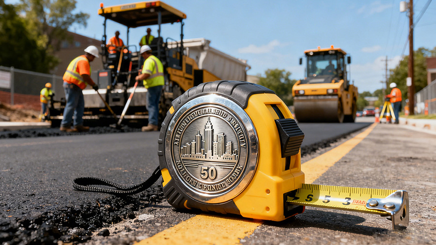
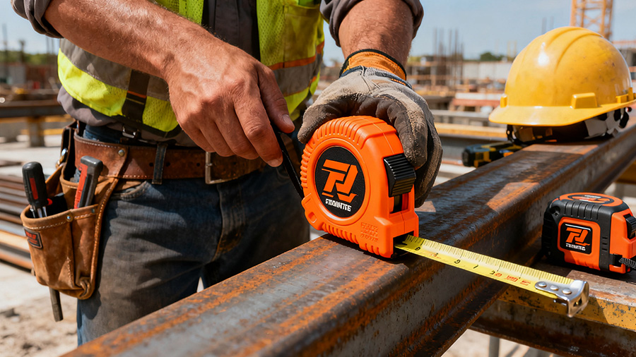
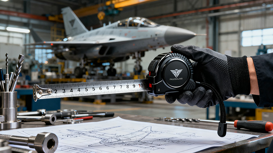
- Construction: Slab-serif fonts (Rockwell) + matte blacks/grays for OEM industrial measure tapes—hides dirt, withstands impact, and pairs with white scales for job site readability.
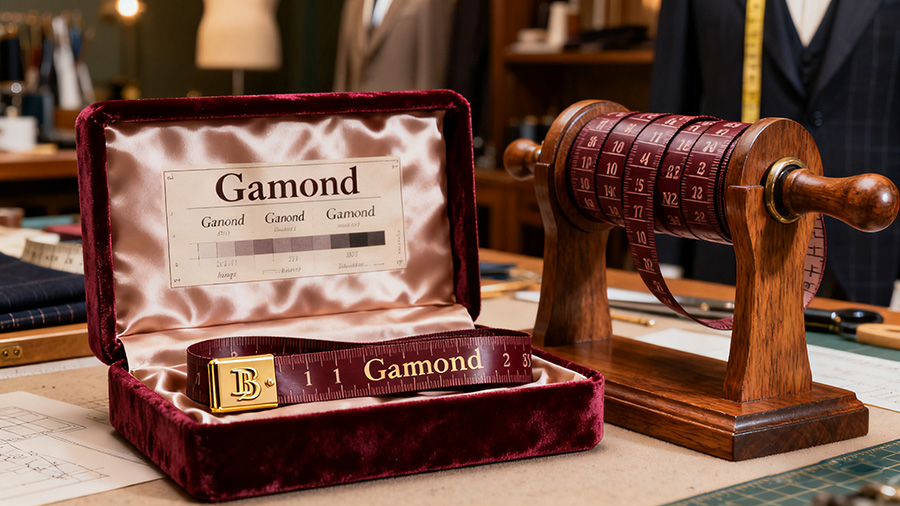
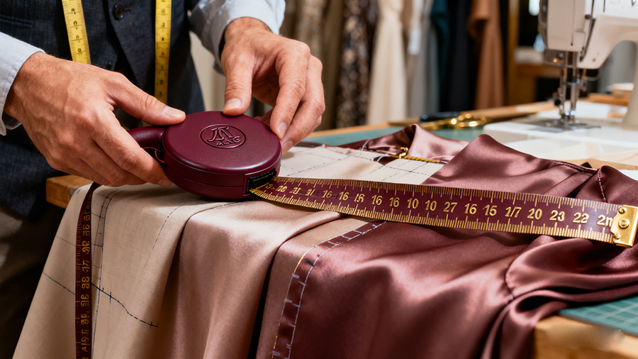
- Luxury Tailoring: Thin serif fonts (Garamond) + deep burgundies/navies for private label fabric tapes—conveys elegance, with embossed fonts adding tactile premiumness.
Each adaptation ensures font and color meet both brand identity and industry functionality.
Importance: Demonstrates Wintape’s ability to tailor font-color pairings to niche needs, avoiding one-size-fits-all designs that fail to resonate with specific audiences.
Wintape’s OEM Process: From Font/Color Approval to Production
Wintape’s 7-step OEM process ensures precise integration of brand font and colors into custom measure tapes:
- Brand Audit: We review your brand guidelines (font files, PMS color codes) and audience needs (e.g., “medical staff need readable fonts”).
- Font Compliance Check: We verify font licensing (to avoid copyright issues) and test readability on tape materials (e.g., will this font show clearly on steel?).
- Color Sampling: We create physical color swatches on your chosen material (PVC, steel, fabric) to confirm PMS accuracy—no digital approximations.
- Synergy Mockups: Our ODM team creates 3D renderings showing font-color pairings (e.g., Montserrat Bold + neon orange on a fitness tape).
- Prototype Production: We build 5–10 test tapes, embedding the approved font and color, to test readability, color fastness, and functionality.
- User Validation: For niche tapes (e.g., custom medical measure tapes), we have target users (nurses) test if fonts/colors meet their needs.
- Full-Scale Manufacturing: We use automated laser engravers (for fonts) and UV printers (for colors) to ensure consistency, with QC checks for font clarity and color accuracy.
This process eliminates guesswork, ensuring every tape reflects your brand’s identity.
Importance: Demystifies how Wintape translates font/color guidelines into tangible tapes, showing brands exactly how we avoid common customization pitfalls (e.g., unreadable fonts, off-color tapes).
Quality Control: Ensuring Font & Color Longevity
Wintape’s quality control system safeguards font and color integrity for the long term:
- Font Clarity Testing: We test tapes for 1,000+ cycles of use (e.g., blade retraction, folding) to ensure fonts don’t blur or wear off.
- Color Fastness Checks: Tapes undergo UV exposure (500 hours), sweat testing (for fitness), and bleach testing (for medical) to ensure colors stay true.
- Batch Consistency: We test 10% of each production batch for font clarity and color accuracy, rejecting any tapes that deviate from approved standards.
Pre-production samples also let you approve font/color finalization—no surprises in full production.
Importance: Addresses brands’ top fear (font/color degradation over time), building trust in Wintape’s ability to deliver long-lasting brand consistency.
About Wintape
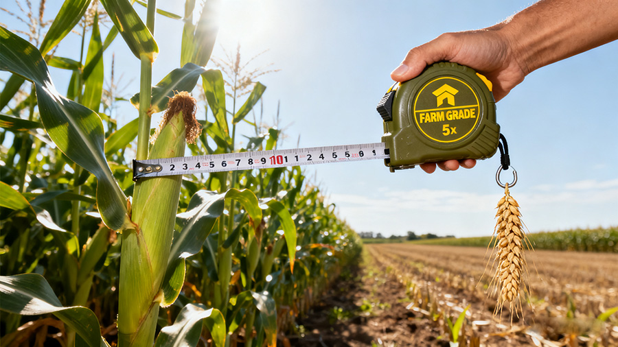
Wintape offers a full line of customized measuring tapes that can be branded with your company information. Our customized measuring tapes are well known in the medical, health, fitness, tailoring, promotional gifts, livestock farming, industrial and construction markets.
FAQ
What font types does Wintape support for custom measure tapes?
We support all licensed fonts (sans-serif, serif, bold, narrow) and can recommend readable options if you don’t have specific guidelines (e.g., Arial for medical tapes).
How does Wintape ensure brand colors match exactly on OEM measure tapes?
We use the Pantone Matching System (PMS) and create physical swatches on your chosen material—no digital approximations—to confirm color accuracy.
Can Wintape help design a font/color scheme if we don’t have brand guidelines?
Yes—our ODM team creates font-color pairings based on your industry (e.g., soft fonts/colors for medical, bold for fitness) and brand personality.
Do font/color customizations add to the production time of customized measure tapes?
Only 1–2 weeks (for font compliance checks and color swatching), with total lead times remaining 4–6 weeks for standard orders.
Will the font be readable on small private label measure tape keychains?
Yes—we adjust font size (minimum 2mm) and type (e.g., sans-serif for small spaces) to ensure readability, even on compact keychain tapes.
How does material affect font/color on custom measure tapes?
Different materials absorb ink differently (e.g., steel reflects colors, PVC absorbs them)—we adjust formulations to ensure font clarity and color accuracy on your chosen material.
Are there font/color restrictions for regulated industries (e.g., medical)?
Medical tapes require readable, non-toxic fonts/inks—we use FDA-approved inks and sans-serif fonts (per healthcare guidelines) to ensure compliance.
Can I test font/color on a prototype before full production?
Absolutely—we provide 5–10 physical prototypes with your approved font/color, so you can verify readability, color accuracy, and synergy before manufacturing.
Wintape Measuring Tape Company
Custom Tape Measure Manufacturers
For All Your Measuring and Promotional Needs.
86-18588000509
cici@tape-measure.com
Custom Tailor Measuring Tape
Custom Body Measuring Tape
Custom Paper Measuring Tape
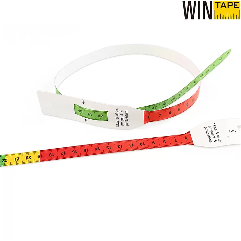
Custom MUAC Tape
Custom Wound Ruler
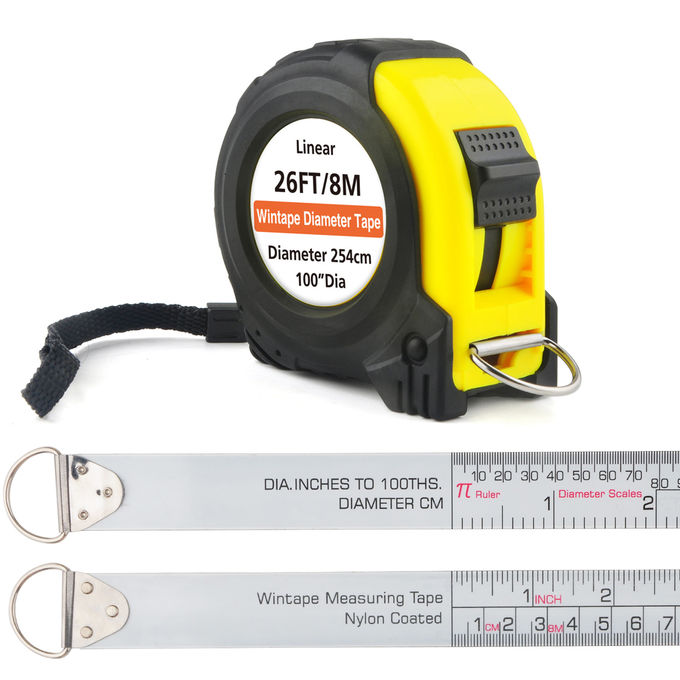
Custom Diameter Pi Tape
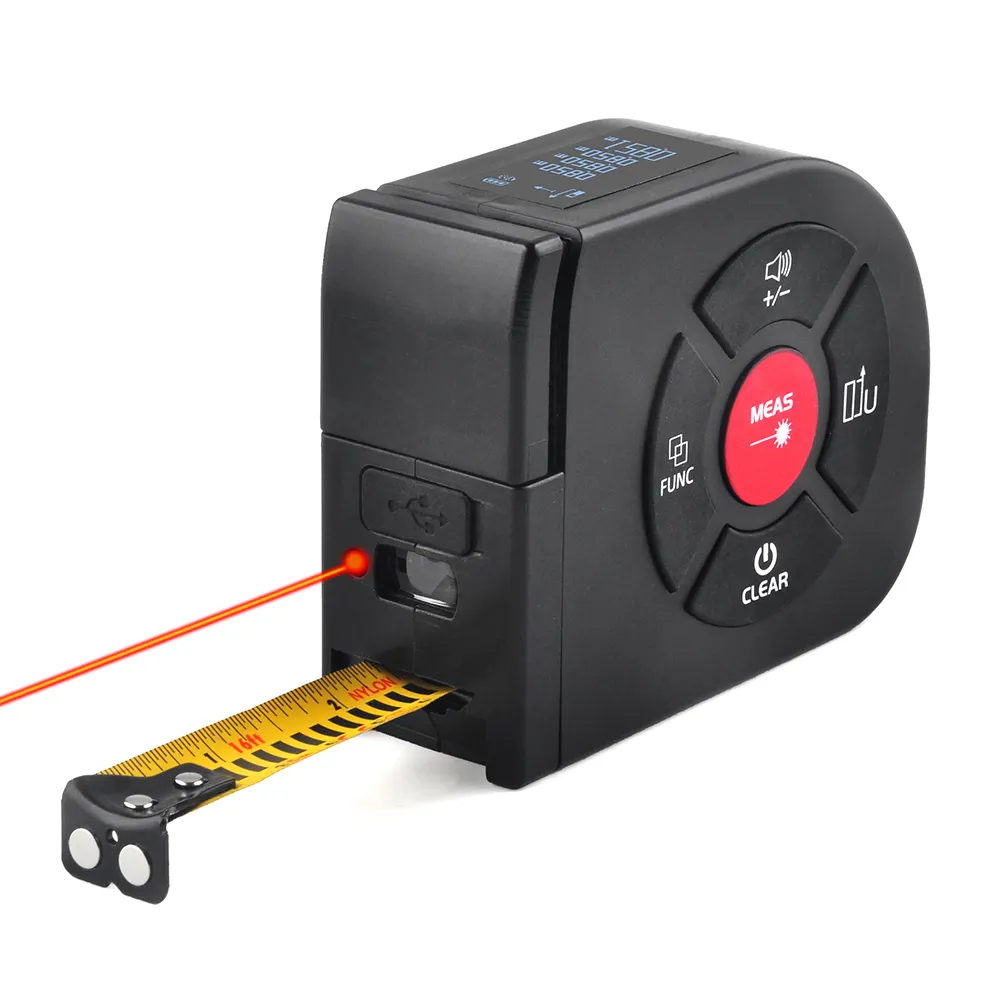
Custom Digital Tape Measure Laser
Custom Adhesive Measuring Tape
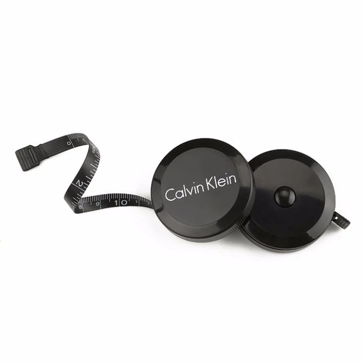
Custom Mini Tape Measure
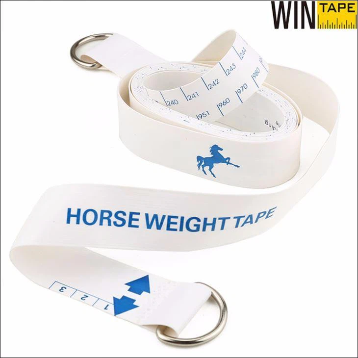
Custom Horse Weight Tape
Custom Stainless Steel Tape Measure
Custom Long Tape Measure
Custom Measuring Tape
© 2025 Wintape Tape Measure Co.,Ltd | Privacy Policy | Sitemap | Contact Us | Powered by matchPages